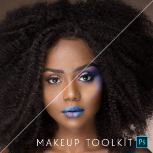
Featured Products
-
Sale!
-
Sale!
-
Sale!
-
Sale!
-
Sale!
-
Sale!
-
Sale!
-
Sale!

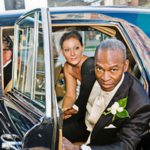
This week’s MCP Blueprint photo is one where a little “action” made a lot of difference, but where it does not have an overly processed look, as it did the past few weeks.
This shot I took of this high school senior was properly exposed but lacked dimesion and vibrancy. With a few clicks and a touch of quick “brushing” I took it from “correct to wow.” I would love to hear your thoughts on if you like this, or would have prefered a more heavily processed look.

Posted in Blueprints, Photoshop Tips
No Comments
Leave a Comment
You must be logged in to post a comment.


Recent Posts


This is great, I love it when you do these. I really need to sign up for your workshops!
I love that you told us all the actions you used because I’m always trying to figure out ways to use some of the actions more. I love the detail of the brick & the red frame on the right it’s fantastic! I think “I” would have liked to see the man a bit softer but only because the black grill work over the door makes the black shirt & hair really pop out in a way that seems to dominate the overall photo. But I guess you would want the person to dominate the photo… hmmm now I’m looking at this photo in a different way all together, you definitely gave this photo lift & life thanks so much for sharing it with us. It really helps so much to see how the actions can be used more specifically!
I love it!
Love the color in this one! Not too much, just rich and vibrant!! Awesome Jodi!
I love it! I think it’s perfect. I don’t think I would have liked it any more processed than this.
I think it’s perfect. The color pop really helps, but it’s not overdone. Thanks for the tutorial!
looks awesome! love it!
I think it looks great overall!!! I would take him down just a tad bit for my personal taste ;)–his face looks a little too bright.
I just love it. It is so sharp and vibrant! Thanks so much for sharing! 🙂
This one is perfect for my taste. Thanks for sharing the blue print. As a primarily JPEG shooter I always shoot to nail the exposure while keeping contrast and Saturation low and adding back later and your actions have been life savers. Thanks Jodi!
I really like the saturation pop, but his face looks just a tad cool to me… Love your actions, hope to buy some more soon!
great…just great! young and fun!!
Love, love, love it!!! Gotta get me some more of those actions.
Thanks for sharing your actions workflow. I will try this on some shots of my daughter
Jodi, this quite a difference and really makes the image go from nice to wow. I have the actions you mentioned, and it’s nice to see how they are used in different situations. Thanks for sharing your talent.
I would of loved to see what it looked like after the Soft Color action.It is alittle to “full of life” for my taste, but I love seeing what your actions can do.Will have to get some of those in the very near future.Thanks for showing us these.. I learn so much by seeing how you come up with the different types of actions and what they can do.Jodik
Love it. 🙂 I think this is the perfect combo. 🙂
I love the way it turned out! 🙂