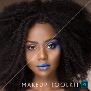
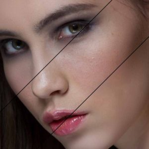
Blueprint – My Take on Sandi Bradshaw’s Senior Photography
I just had to play. Check out yesterday’s post for detailed step by step of how Sandi Bradshaw edited this photo.
Here are my plays.
MCP All in the Details: flashlight action – changed opacity to 100%
MCP All in the Details: extreme color action – used the extreme color painting on grass and tractor. Used detail layer at 46%. Masked back skin and guitar at 100%.
MCP All in the Details: hide and seek action – Used “hide” on the background and seek on the skin
MCP Magic Skin: Magic Skin at 42% and Skin cast blast – bye bye mellow yellow and a second color correction curve
MCP Eye Doctor
After 1, 2 and 3 all are the same except that for 2 and 3 I added sky at the end. I used the magic wand to select the sky. Then I added a new blank layer and used the gradient tool and made the sky. I added a mask to clean up any areas that needed it. I did this with a blue gradient in after 2. Then on the sky layer I added a hue/saturation adjustment layer and clipped it to the sky. I played with the hue until I ended up with after 3.
After looking this over, my critique is that I went too far with the sky. I wish I lowered the opacity of the sky more so it was less obvious. But it may just look obvious because I am looking at it next to the blown out sky. Hmmm. I also wish that her face did not look so flat. As I fixed exposure it lost detail. And I could have tried going a little darker to retain detail.
I decided to do one more play. Normally I love Color. But this Pastel Looking play – well – I just liked it better.
For this one I used:
MCP All in the Details: flashlight and put opacity to 100%
MCP All in the Details: pastels – default – then masked off skin on detail layer
MCP All in the Details: dusty 35%
MCP Touch of light on the face and skin
MCP All in the Details: in stark contrast action at the default opacity
Then I resized for web and added a frame and border. As always I would love to know what you think…
Tags: Blueprints, color correction, editing, MCP, MCP Actions, mcpactions, photoshop, Photoshop Actions, Photoshop Actions, Photoshop Tips & Tutorials, sandi bradshaw, senior photography27 Comments
Welcome to the MCP Actions Photoshop Blog
- Learn to enhance your images with time saving Photoshop tutorials. Join us for daily blog posts with the latest photography and photoshop tips, contests, photographer interviews, and blueprints teaching how to use photoshop actions.
Featured Posts
- Editing Landscape Images Using Actions in Photoshop
- My Camera Takes Really Nice Pictures
- Over-Editing in Photoshop: How to Avoid 25 Common Editing Mistakes
- Portrait Photography Trends & Fads: The Good, The Bad, The Ugly
- Finish It Photoshop Actions Set Now Available ~ Changing the Way You Prepare and Display Images on the Web
- See All Featured Posts
Recent Posts
- Win Holiday Card Templates from Photographer Cafe
- Photoshop Alone Does Not Make a Good Photographer
- Watch Me Work: Photoshop Actions & Workflow Online Class
- Tips for After Your First Portrait Portfolio Building Session: Part 2
- 7 Tips for Your First Portrait Portfolio Building Session: Part 1
- See All Recent Posts
Polls
Photoshop Tips
- Outdoor Image Fixed in Photoshop: Better Sky ~ Better Lighting
- Senior Photography: Tips and Tricks on Posing, Locations and More
- Using Photoshop Actions to Enhance a Blue Sky and a Rainbow
- Photoshop Actions: Glossary of Offerings by MCP Actions
- Photoshop Actions: A Guide to Choosing the Best Actions
- See All Photoshop Tips
Video Tutorials
- Photoshop Video Tutorial: Watch Me Work {Color Pop, Eyes, Skin}
- The Secret to Using Photoshop on an iPad and iPhone
- Installing Photoshop Actions in Elements: Video Tutorials
- What Are Photoshop Actions And How They Can Help Or Hurt Photography
- Free Photoshop Action + Video: To Add Texture to Photos in Photoshop
- See All Video Tutorials Posts

Categories
- Activities
- Announcements
- Assignments
- Blueprints
- Business Tips
- Cancer Awareness
- Contests
- Discounts, Deals & Coupons
- FAQs
- Featured Post
- Free Actions
- Free Photoshop Stuff
- Guest Bloggers
- Interviews
- MCP Collaboration
- MCP Thoughts
- Photo Sharing & Inspiration
- Photography & Photoshop News
- Photography Tips
- Photoshop Actions
- Photoshop Tips & Tutorials
- Polls
- Social Networking
- Video Tutorials
- Workshops


9:12 amJune 19th, 2009
Hey Jodi,
I think i like #2 the best, i think the blue sky makes her stand out. as always, great editing. How did you do at the Mac store the other day? You decide on a Mac yet?
9:19 amJune 19th, 2009
After all is said and done, I think I like the Pastel the best. It just seems to fit the mood of the photo. And it’s funny because I don’t usually go for the pastel looks, but this worked. Thanks for sharing, Jodi!
9:28 amJune 19th, 2009
I love after #3!!
9:45 amJune 19th, 2009
I love the last one with the border! Any chance you’d consider doing a step by step tutorial explaining how to create that effect with the sky? Thanks. I love your blog.
9:51 amJune 19th, 2009
I love the last one! The pastels are beautiful and very lovely with the image!!
10:03 amJune 19th, 2009
I like number 1 the best with the white sky she really pops out in the photo – I did like 2 also but the blue sky against the green grass competes with her for my eye’s attention – it has a great overall effect but I love how she is the total focal point in the first photo. It’s a amazing what small changes make to the overall photo. As always wonderful work Jodi.
10:20 amJune 19th, 2009
LOVE the pastel. thanks for sharing =)
10:50 amJune 19th, 2009
I like number one as they are….but I think number two would probably jump up on my list if (as Jodi stated) the blue in the sky was toned back down. Good job Jodi
10:53 amJune 19th, 2009
I LOVE the pastel one………love!
10:54 amJune 19th, 2009
I like “after 2.” The blue sky and green grass seem to say, for me, “I’m home”
Beautiful job Jodi!
11:00 amJune 19th, 2009
I like the yellow sky surprisingly. I think if it was a little lighter, it would balance things out more. Nice!!
11:12 amJune 19th, 2009
Ditto Martha. I love the pastel. It just fits. Thanks, Jodi.
11:23 amJune 19th, 2009
The pastel look is one I’ve been seeing a lot lately, very popular and people seem to love it. Thanks for showing how you did it. Now I can try!
11:31 amJune 19th, 2009
I like all the edits except for her skin/face. They look too washed out and her facial features practically disappear. I think if you take the unedited version and create a layer mask out of it, and place it under the edited layer, then using the eraser tool on about 40% opacity w/soft round brush and erase just her face and arms on the edited layer so that the unedited underlayer starts to show thru, that it looks better. I took a play with it on my computer and it looks better, to me, since she looks more tan and you can see her facial details better. Just my 2 cents. #2 and 3 are my faves, and I love the pastel.
11:36 amJune 19th, 2009
I may need all of your actions now…slowly but surely!
12:03 pmJune 19th, 2009
I love after 2 and the pastel … you make it look so easy Jodi
12:17 pmJune 19th, 2009
i’m going to have to say the pastel on too! (although, i’d actually prefer it without the boarder)
but i also love both the ones with the added sky. it makes such a difference!!
12:54 pmJune 19th, 2009
this was an awesome step-through, jodi! thanks! i especially appreciate the tip on adding the sky–believe it or not, i had never thought of doing that before! =P thanks again!
1:23 pmJune 19th, 2009
jodi,
really like all of your plays on the image! i think my favorite is the pastel look because actions like that are so popular right now & i love how it brought the sky together with the rest of the image.
i have a question about sandi’s tutorial that i was wondering if you can answer:
i am seeing the terms “saturation brush” or “desaturation brush” and can’t figure out what this is supposed to be…i haven’t seen or heard you use that term in any of your tutorials. maybe i know what this is but haven’t heard this particular term?
any help?
thanks jodi!
1:53 pmJune 19th, 2009
All three are great, but because of her face/skin, I think the pastel version is best. Her face did lose a lot of detail, but I like the blue sky much better than the white, and the golden sky looks good too. Often those colorized versions are not my thing, it’s only when you get the right image that I think it works. I guess this is the right image! Thanks for this. It’s interesting to see different plays and also to hear the various comments which are definitely not skewed in any particular direction! Go figure.
2:16 pmJune 19th, 2009
I LOVE ‘after 2′….gorgeous!
2:17 pmJune 19th, 2009
I think the face did lose too much detail. It needed to be a little darker. The blue sky is a little too overdone for my taste. I like #3 better. However, I think the pastel is great for this pic. I like lots of color normally, but the pastel just suits this pic so well. Thanks for all the options. Thanks for teh sky tip. I can’t wait to try it.
2:39 pmJune 19th, 2009
#2 is my fave … the blue looks great! My second fave is the pastel … I think that would look great with some texture too!
8:25 pmJune 19th, 2009
I kind of like the blue sky. Her skin looks almost too perfect. Maybe that is just a wierd thing I am thinking though. I love the picture. VERY cool!
8:39 amJune 20th, 2009
I would have never thought pastels could look that good! I have really enjoyed using that extreme color action!
8:58 amJune 23rd, 2009
Just wondering if there is a good way to avoid the halo around her arms? She kinda looks like she is glowing. lol I get this sometime…do you have any advice?
9:50 amJune 23rd, 2009
Yes – you can if you take the time to zoom way in with a harder brush and mask back when the change occurs. There was actually a light halo in the original – but the fast editing I did made it more pronounced. I could have avoided it if I spent a lot more time at pixel level editing.