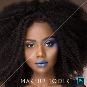
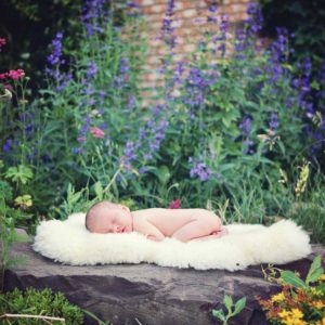
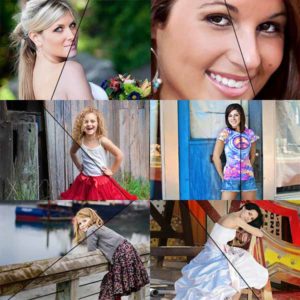
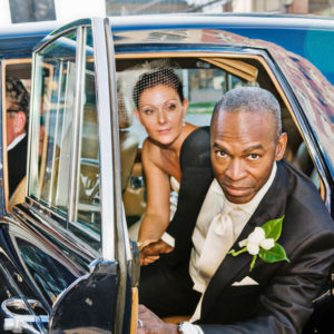
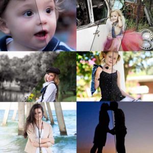
Featured Products
-
Sale!
-
Sale!
-
Sale!
-
Sale!

-
Sale!
-
Sale!
-
Sale!
-
Sale!

Use Photoshop Actions to Add a Touch of Beautiful Lighting
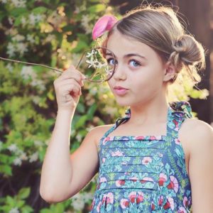
Some photos may have a correct exposure but may benefit from selectively lightening or darkening parts of the image to draw attention in a specific direction. In this photo taken of Jenna by a tree, you can see beautiful light coming through her hair. The subject back-lit. I over exposed what the in camera meter was telling me so that I could achieve decent exposure. Once in Photoshop, my eye was still more drawn to the bright background. I wanted Jenna to be the primary focus.
To edit this image and achieve this:
- I started by using Color Burst from the Complete Workflow Photoshop action set. I used the paint on pop layer but reduced opacity to 40%. All other layers of this action ere left at the default numbers. This action added extra color, contrast and sharpness to the image.
- Jenna’s face still was a bit darker than I wanted. Next I used the free Photoshop action, Touch of Light/Touch of Darkness. I used the brush tool at 30% and painted on her face and hands with the “Touch of Light” layer selected. Then I switched to the “Touch of Darkness” layer and used the same 30% opacity brush to darken the edges, tree and background. This helps the viewer focus on the girl, Jenna, instead of the background.
- Lastly, I wanted to see what the picture would look like in black and white. I used Vanilla Ice Cream black and white Photoshop action from the Quickie Collection. Though I like it in black and white, I definitely prefer the color for this image. Though the black and white conversion is more timeless, the color just tells a more accurate story of the day heading out to the pumpkin patch.
Which do you like better – color or black and white for this shot? Tell us in the comment section below.

No Comments
Leave a Comment
You must be logged in to post a comment.


Recent Posts


I really like the middle one, the one with color and the enhancements…nice work as usual!
I like the color much better! Isn’t it amazing how small changes can have such a big impact?!?
I’m with you…definitely the color!
You do know you’re a genius, right??
This is a great transition! While I love the b&w image, the final color image just has a lovely warmth that reflects the season.
Color! That is amazing for me since I’m a black and white junkie, but this picture just stand out so much more in color!
Definitely like the color version!!
Color for sure!
Agree color is best for this image.
As mentioned in your post, I think the black and white is timeless. My favorite is the color. Especially, if its part of telling the story of your day at the pumpkin patch. Autumn colors are breathtaking.
Color!!
I love the color. The pop of color is amazing. I need that action set!!
definitely the color!!! 🙂
It was really excellent post! thanks a lot for sharing with us!
I am a B&W fan but much prefer the color in this case. Too little gray variation.