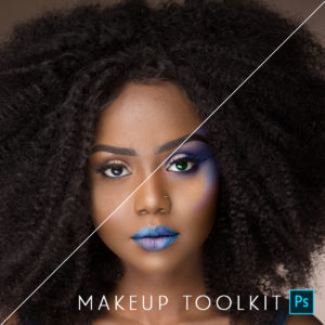
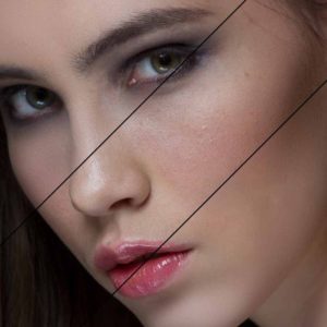
Featured Products
-
Sale!
-
Sale!

-
Sale!

-
Sale!

-
Sale!
-
Sale!

-
Sale!

-
Sale!

Whether you prefer color photos or black and white imagery, there are times where you may want a classic black and white photo. Most photographers shoot in color, but it can be as easy as a few clicks in Photoshop to get rich monochromatic images or more subtle film like black and white conversions. Using this color photograph submitted by Spanki Mills Photography in Texas, I will show you a few options using the MCP Fusion Photoshop action set.
Here is the straight out of camera image of a baby girl:

Next are three conversions to black and white. I would love to hear in the comments which you prefer most and why. The step-by-step Blueprint showing exactly what actions were used and at what opacity is listed under each photo.
The 1st image is meant to give a look similar to black and white film. Lower contrast, lighter tones, very classic.

This next edit used a deeper conversion with more contrast, but grayer midtones. This gives the photo a darker overall quality.

The last photo edit has a warmer toned black and white feel by combining the higher contrast Timeless with the Toned Sunkissed action using Black and White Fusion Mix and Match.

After viewing, what are your thoughts? Which black and white look speaks to you? What is the most visually appealing? Taste is subjective but it is always fun to hear opinions. Thanks for your thoughts.
No Comments
Leave a Comment
You must be logged in to post a comment.


Recent Posts


Absolutely love my bag of tricks! Thanks for such great actions!
Love the edit. Thanks for posting this and sharing the tricks. I use MCP on every photo I edit too. Love your stuff Jodi!
Gorgeous edit…I wish I wasn’t so scared to take my colors to that point…LOVE ITAnyway you could point me to the action Magical Clarity, I would really like to check that out
Magical Clarity is included in Bag of Tricks… love the actions. I use Bag of tricks and Fusion a lot, and the Facebook Fix, too!!!Can’t wait to save up some money to get the rest of the actions!Love your stuff, Jodi!!!
love it! Beautiful! I love MCP! I too use these actions on my prints!
I love the edits! Not too much or too little… perfect!I haven’t used “Magical Clarity” before and need to check it out.
Wonderfull editing i was always wondering the photos u genreally see in any apple products like ipad or mac are so vibrent.. N colourfull so this is the scret of increasing colours in any picture u take. But this is edited in which application