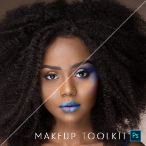
Featured Products
-
Sale!
-
Sale!
-
Sale!
-
Sale!
-
Sale!
-
Sale!
-
Sale!
-
Sale!

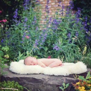
How to Edit Newborn Photos in Photoshop
One of the things I love about editing with MCP’s Photoshop actions are the adjustable layers. Most MCP Newborn Necessities actions don’t require flattening, so you can edit and retouch, and have the flexibility to re-work things as needed.
The baby in the photo below was reddish yellow and had purple/red hands and feet. Also, the photo was underexposed. The photo was taken late in the afternoon as the family was moving out of state the next day. The sun was setting and I used a diffused, bounced flash.

Here’s how I edit newborn photos in Photoshop (including the image above):
* After some minor adjustments in Adobe Camera Raw I brought it into PS. While this sounds like a lot of steps below, it actually is extremely fast, as compared to making each of these adjustments from scratch. You can adjust any of these steps to fit your image and edit as much or as little as you choose.
Step 1. Increase Exposure action – I brought my opacity up to 15%.
Step 2. Pick Me Up action – with a 53% opacity. I like that it gives the photo a little bit of pop but not going overboard. You can adjust this later to give yourself more or less pop but for now I am leaving it at 53%.
Step 3. Baby Bottle action This action will give you a nice white haze on your photo.
Step 4. Since his skin was a bit too yellow I used the It’s A Boy action to neutralize the yellow. You might not need to do this step but I use it if babies looks jaundice.
Step 5. Paint On Formula action – I love that sometimes you can run an action and it will just nail it for you. Paint on Formula is an action that I use in all of my newborns. I LOVE this action because it helps quickly fix spots of color, rather than on the entire image.
- The first area I worked on was that purple hand. Using a white brush with a 30-40% opacity you paint on the proper fix. In this case – Magenta/+ Green. I went over it a few times. Tip: If it starts to look green, you can switch your brush to black and fix your mistakes.
- While still in Paint on Formula layers, I selected the – Red/ + Cyan. This will start to pull out all the red and add a little bit of cyan.
- To adjust the tones on his little foot, I used the items in #1 and also went into the + Yellow/ – Blue. I added a little bit of yellow back. We used It’s a Boy to neutralize so only use this on areas with the weird color casts from using the other steps. I also used this on his hand because it was a little more red than I would have like it to be.
Step 6. In My Dreams action When the action runs look for a good colored area of skin that want to try to use through out the rest of the skin. I had to choose one area for his hand to keep it a little darker and another for the rest of the skin. Once you run it your skin should all be pretty even now. Run it a few more times on different parts of the skin if you feel it is necessary.
Step 7. Baby Lotion action – I normally don’t smooth newborn skin too much. You can go overboard really easy. When you run this action it will take it to the very bottom of the layers right above your background layer. Lower your brush to 30% and pain on areas that you’d like to smooth out a little bit.
Step 8.I felt he might have looked a little too pale or gray so I ran the Paint on Gray Skin Fix and popped him up a bit. My brush was at 40% opacity and I left the action opacity as it was.
Step 9. Blushing Paint On Cheeks Bring a little pink back into your skin by using this action and your brush at 45% opacity. If it’s too pink then lower the opacity of your brush. You want a little bit of color but not over pink.
Step 10. Cool Vignette at 25% opacity
Laura Short, the guest writer and photographer for this image, is the owner of September Smile Photography. She’s a Navy veteran and currently lives in Austin, Texas with her four children and husband. Laura is a lifestyle photographer specializing in maternity, newborns and children.
No Comments
Leave a Comment
You must be logged in to post a comment.


Recent Posts


Just wanted to say….. BEAUTIFUL captures Jodi!
I like 3,4,5,7,9,18 of the eagles.
I’m not seasoned in photographing wildlife either, but aesthetically number 9 or 13 works best for me. There’s such a focus on just the bird! But, if you want the picture to also include the true background you saw it in, I like 7 and 8 as well. More of an opinion instead of expertise but I hope it helps anyway!
My vote is for #9. I love that one! I kept coming back to it after I had seen the rest. Guess that means it was my favorite! I think it looks like it could be used in a nat geo magazine. Great work!
I like #12
#4 – Love the colors and sharpness.#9 – Eagle against pure blue background really makes it pop!#10 – Again, colors and sharpness are awesome, but I really like the composition.These rock!!
Love the eagles photos! I have to go do this in my area some day. My pics would be numbers 9 and 10, although on number 10, I might try flipping the image horizontally.
I love the fish in the talons in number 5. Love the color and facial aspects of the eagle in 10. If you go to Homer your next trip – the eagles sit on the beach (more showed up when the elderly lady would feed) and you can get some spectacular angles there! Awesome job!!!
Love numbers 9 and 11! They’re all beautiful, Jodi!
OH, and love 12 too!
I like 1 and 9 for blowing up in your house! 🙂
I really like #1. I like the circular water pattern contrasting with the strong wings of the eagle and the reflection.
I’d definitely choose between 5, 8 or 10. Definitely some great shots there.
Hi Jodi, Thanks for the tips. I just came back with a ton of photos from Provence, France, and this will help me greatly in editing. My favorite photos are #9…I love the clear background and closeup of the eagle’s eyes, plus the wingspan. I also like the closeup in the tree in #18. They are all awesome images and I hope you post more from your trip.
#9 or #10 best!!!awesome photos!
Wonderful photos. I vote for numbers 10 and 18.
9 is the strongest. Sime bkdg and it doesnt get lost like the others
#9 and #12
Definitely number 10. That is an amazing shot that you won’t see just anywhere! The wing detail and the while of the bird really clear! Wow! Gorgeous.
5, 9 & 18 get my vote!
Jodi – I especially like 3,4,5 & 10, but all of these are fantastic shots! Thanks for the tips and advice you share!
I love 5,9 and 11. These are so awe inspiring. I personally do not enjoy shooting wildlife, but really appreciate and enjoy viewing. Just curious, I have a the same lens, but have never used an extender. Do you find it to be a big benefit?
I love #9, there is no background scenery which makes the eagle stand out loud and clear. Love the clarity of its eyes and the capture of its full wingspan. All are awesome shots, but this particular photo is amazing!
3, 4, 5, 9, or 10. The water overwhelms in 1 and 2. I like a bigger color contrast between eagle and background and closer subject. 9 is probably my favorite.
My vote is #9. It communicates the majestic nature of the bald eagle through the gorgeous wingspan you captured. I love that you can see each and every feather! #10 is my next favorite as you feel like you are flying with the eagle. The composition is balanced through using the rule of thirds. Also, the layers of the background compliment the trajectory of the eagle. If you clone out the “line” behind the wing that is further back and down through the feet it would put all the focus on the eagle. Stunning images!
5, 7 or 9, mostly because of the eyes.
I love 1, 9, 10, and 18! What a privilege to be able to photograph such a majestic bird in the wild!
Big fan of #1 & #2
16 Is my favorite and then 5
Very overwhelming, they are all great. #1 and #14 are a couple I really like because it shows them in their natural habitat. But #9 is my favorite, his eyes are so intense. It makes me wonder what he is thinking. Alaska is my favorite vacation destination. We are usually on the Kenai Peninsula. Where were these images taken?
#9 is amazing! #18 is great too!
Beautiful pix! Is there a fast edit like that besides Lightroom?? I don’t have it.
I love 9, 11, and 18. 🙂
I really like #5 & #9 both show a lot of power. Great captures!
Goo afternoon lass, thank you for your helpful tip. I personally find #9 to be my utmost favorite of all of your photos as it is the most “Majestic” of the lot – as it really exudes power, elegance and majesty of the eagle so well. Great job lassie.Respectfully yoursBrian
Number 9!Thanks for the tips above.How do you “save a fav” preset within the set?I know how to save presets as user presets, but it sounds like you’re doing something different. Can you please explain? Thanks!
the 9 is just… amazing! great picture, great moment, great view. Thank you for the tips. I don’t have Lightroom, just CS6 and it take a very long time for me to do the selection and after enjoy with your mcp actions. What do you thing i would do (before buy lightroom!). Thank you and sorry for my english! Flo
#10 is the standout to me. The warm background makes the eagle standout.
#10 is the standout to me. The warm background makes the eagle pop. I also like #4 as well, very beautiful.
I like 10 the best and then 5.
my faves are 4, 5, 6 & 9
2,5,7,9,11,17 to me are the ones that stand out the most.
Number 3 is my favorite since you’re above the eagle and it’s a more unique shot. But number 9 is a close second since it’s singularly focused on the eagle without any background distractions. I used to have a poster by a famous wildlife photographer that was similar to 9. 🙂
They’re all very good – #9 hands down, #11 or #13 as a second choice.
3, 9, and 13 are my favorite because they each show how majestic the eagle is. Those 3 images show the wing span, the action, the face, all the unique characteristics that probably really draw you to this creature in the first place.
Great shots! I like #5, #9, & #10 best!
Favorites were 9 and 18.
5 and 7 are my favs!!
My favorites are #3 & #9 and I agree 9 is the strongest.
All are beautiful but I prefer 9 and 10 showing the wing span of the eagles. 5 is a runner up but feel the background distracts from the eagle. Hope this helps 🙂
9!!!!!!!!!
10
9 + 10 + 13 are my favs. Great shots!
They are all so beautiful, thank you for sharing.
4,5 and 10
9, 18, and 11 — in order of preference.
They are all beautiful, Jodi!! My favorites if I have to pick are 5, 9, 10,& 18. Makes me want to go to Alaska right now.
Jodi, The image that appeals to me the most is #9. This shot is tack sharp, shows all of this birds “fingers” and there is no background distraction. It might look nice to add canvas on both sides, more on the left to give him room to fly and also to deeper the blue of the sky. Amazing images! Have been to Alaska twice and would go back in a heartbeat if given the chance!ä_¥Ÿ
# 9,18 look like a strong image to me. Really nice pictures however.
#9 and #12 are both awesome!
WOW!! Amazing photographs!! I love so many of them…let’s see 5, 6, 2, 9, 10 – they are all so wonderful!!
Definitely #3 and #9!!! Beautiful 🙂
9 & 18 are my favourites. I’ve been to many markets (I’m on Vancouver Island) where vendors are selling their eagle prints. Yours out perform them by miles. However, 9 & 18 are ‘poses’ I haven’t seen. The texture of the tree adds another dimension and the idea of camouflage is so wonderfully demonstrated. In #9 the isolated bird with such clarity and detail is stunning. Reading the other comments, you have votes for almost all of the images. I guess you’ll have to print them all!Now I’ll go and read your article – your images got my attention first 🙂
Each photograph is amazing, and thank you for sharing all your work and tips here.#9 is my absolute favorite!Closely followed by 3, 5 and 7! (Something awesome about those odd numerals!) What an amazing vacation you had!
If I had to pic 1 = #10. Great shots!
9!
All of them are beautiful shots..I can see why you have a hard time picking!! But my favorites are #5 of the eagles in flight, and #18 of the sitting eagles.
I loved them all, but I kept going between #9 and #18, although I really loved that you could see the fish in its talons in #5. I think that #9 is probably the strongest because there aren’t any trees or anything in the background that distract from the eagle. Great work!
9 & 12 for sure! Beautiful!
I really like 2. You see the droplets coming off the first eagle’s feet, their reflections in the water under them and the ripple in the water.
#9 was my favourite – lovely and sharp with plenty of space around the eagle
#2,9,and 10 are my favorites. Just beautiful!
What gorgeous images! #9 really jumped out to me when I saw it. There are not distractions from the background. If you want the Eagle to be your focus, then this is the one! I also loved #2 because it shows so much motion and tells a story. They are all fabulous!
Definitely #9!THANK YOU for the great tips on quick edits. I recently shot an Everclear/Eve 6 concert, and even though I am am amateur I walked right up to photographer’s row and nobody questioned it(!!!) and I got hundreds of shots. Your advice will help.
My favorite out of the bunch is #10. I love the background showing him in his natural habitat. I can just imagine him ready to take a dive for a tasty fish.#9 is great too in that just isolates him. I do like #18 in that classic pose. I think would like it even more if the sky was a nice blue.Jodi you did an awesome job capturing these magnificent creatures! I can only imagine how exciting it was to see them in nature.
#9 caught my breath. It is stunning! One other trick I use is to consider a caption. You mentioned you want to blow this up to hang in your home. What is the message you want to convey? Thinking of a caption in relation to each photo (or group of photos) will help you narrow it down. For example, if you wanted to say something about the relationship between parent-child, then you would pick #14-16, something about protection/defense/watchful eye might be 18, etc. It won’t make the choice for you, but it might help narrow the field. If you want it as a statement piece, what is that statement going to be?
I love the ripple in the water of# 1. I love the Rugged look of the bird in #7. But because it’s focused the most, and none of the wings are clipped, I say #9 is the Strongest Image =)). What an experience that must have been. How exciting for you!
I like 3, 9, 10, and 18
Do you have to have Enlightenä‹¢ Lightroom Presets to do all of the pictures at once? I have LR5
WOW – I see your dilemma. Those are all amazing in their own right. But, if you are narrowing it down to just one, I have to vote for 9 with 18 as a close runner-up. 9 features a clean background that really isolates the radiance of this gorgeous creature. 18 emphasizes the serenity of the bird, rather than the often-captured and displayed eagle in flight. I recommend that you produce a collection featuring a few of these images because they are all stunning.
I like number 5, I think the black and white sort of stand out more in front of green than on water, or where the skies are overexposed, thanks for the tip, will try that right now that I came from vacation!:D
Oh my gosh! I want #9 on my wall! Beautiful job on all of your images Jodi.
14 and 18 The rest are good but routine. You want to hang something different that you took. 14 the mother looking at her chld, showes a connection.
I thought 3,5,7,9 were the most powerful. Thanks for the tip and the view of your awesome pics!
4 is my favorite with number 9 a close second. The lack of background elements is just another bird flying, but #4 shows the bird in it’s natural habitat doing what it does best.
Thanks for the tip. My picks are # 4, 5 and 10.
I really love all of them but #9 stands out for me. Good luck! Or just print them all!! lol