Featured Products
-
Sale!
-
Sale!
-
Sale!
-
Sale!
-
Sale!
-
Sale!
-
Sale!
-
Sale!

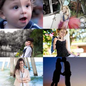
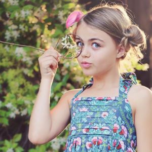
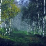
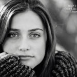
Let’s keep things light today and take a quick survey. Which edit do you prefer?
Both are exactly the same, except the second one used two additional Photoshop actions (mostly on the background). I am curious to see if you see this image the way I do – but of course, there is no right or wrong answer.
MCP Inspire is at INTRO pricing, which saves you $20, for just a few more days.
<< BUY IT NOW! >>

Posted in Blueprints, Photoshop Actions
No Comments
Leave a Comment
You must be logged in to post a comment.


Recent Posts


I like the first one. I always gravitate towards brighter colors though.
I prefer the first, as well. I really enjoy the bright and vibrant colors of fall.
I like the second one – the girl is the subject/focus rather than the whole landscape. In the first pic, the leaves are the ‘punch’ for me, in the 2nd pic, the girl is the punch for me. That said, the vibrancy in the 1st pic is gorgeous and you couldn’t go wrong w/ either pic.
#1
#1
#1
Side-by-side the first one next the second one look a bit washed out. However, focusing only on the second one, I believe I like the second one better! I vote #2
Wow! What ever happened to good old-fashioned proofreading?! I should have checked that BEFORE I submitted it!
I prefer the first one. It’s more powerful.
1st 🙂
#1
I like the first one the best..
I like the 1st one.
The first one. I can’t say I like the haze on the second. It’s distracting for me.
I, myself, prefer contrast and color. But the other looks is pretty popular right now too, so I figured we’d survey :)I also think if separated out – it makes the 2nd look better than next to the first.
I too prefer number 1.
I LOVE #2! They are both beautiful but the second one is stunning. It looks like a true work of art and I definitely agree that the subject stands out more in the second one. Gorgeous!
Definitely the first one. I’m all for rich colouring.
I like the first 1.
#1
I like #1 best!
Prefer Number 1 as I prefer vibrant colour
They are both great but I prefer the first one.
I like the colors in the 1st one much better. I know the haze is all the rage right now but I have never gotten in to it.
I like #1 the best, but honestly, I tend to like atmospheric haze and I think it might be the ‘crop’ that’s throwing the second one off for me. I think were it cropped wider, the girl would really pop out of the hazy leafy background and be the focus and the leaves would create a cool tunnel effect around her, but because its cropped so close to her, the whole thing is a bit distracting and washed out. I’m bemoaning my broke status right now, though, cause ALL of the actions used look truly outstanding! Love your stuff!Rachel of OddModicum
Rachel – that is a great point and I actually was considering that myself – I wondered if it that was part of why the 2nd did not feel right with that edit.
I also prefer the vibrancy of the colours in the first photo. I like the haze but I prefer it when used on a photo with pastel colours.
The first one- I see the second one pretty often among photogs- do you think its a trend?
I like number 1.
I love color, and I love rich colors – especially in the fall. So it’s number one for me. I think the second edit would be great on a paler photo, maybe a winter scene or a beach scene?
I like the first… the second one looks too ‘fake’ to me since the background is so light or ‘washed out’ compared to the subject.
I like the first one better!
1st one…
I like #1. I tend to like the colors of fall to really shine!